Tuesday, 31 January 2012

Analysis of Contents Page #Kerrang


I looked at Kerrang’s contents page and explored the different features the page consisted of. I looked at the layout and composition of text and images, also the colour scheme they went for.

With the layout and composition of the text and images, I saw that everything was arranged in columns this gives the page a better appearance and it’s easier to find things. On the left hand side, they use numbers to help match with the images, this is more of a practical way of using visual contents because the audience will be able to find what they’re looking for instead of flicking through the pages.
With the main image it stands out more because it's the main cover story which would appeal to its audience. On the top right they use an editorial which helps to introduce the magazine and compliment it.

The use of colours steer away from the stereotypical view of what a rock magazine will or should look like- the typical colours that would be used is red, black and white those colours are really bold; but this contents page uses black and yellow. Yellow is a very neutral colour and it stands out against black- this conveys a sense of sophistication to the Rock magazine compared to Kingsize were they stuck to the typical colour of red and black. The reason why this magazine would’ve went for a more sophisticated look is because they would attract more costumers and it’s a popular magazine which is read quite regularly. This magazine uses juxtaposition because the contrast of the key image and the typography could convey two different meanings- the image implies masculinity and confidence through his body posture and his tattoos. He’s also using hand gestures which convey profanity which could suggest he doesn’t care because he knows he can do it and it peruses more confidence. Whereas the typography is more curvy than sharp; the use of sophistication makes the magazine more accessible for a wider audience.

Overall this contents page puts together a slick composition and layout to be more appealing to its reader, also the colours and images work together to convey a better meaning to put across and it diverts from the archetype view of what a Rock magazine should look like.

Sunday, 29 January 2012

Analysis of Blender # Jay-Z


Looking at Blender Magazine I explored the different features the magazine consisted of, which was the layout and composition and the different media conventions which is displayed on the front cover.

This magazine consists of three colours: red, white and black. The connotations I got from this was that red is a very powerful colour and it represents power and passion; the white suggests elegance and sophistication and the black could connote seriousness and dominance. We see through the front cover the continuity of the same colours being used in the sell lines, puffs, masthead and the main cover line, they all tie in and compliment each other. This is to create a slicker look to the front cover also the colours could suggest the type of genre the magazine could be: i.e. Hip Hop, Rap or R 'n' B.

With the typography its very bold and written in upper case lettering, this helps it to stand out more and grab it's audience. With the line going through the masthead, this shows a visual pun and it could suggest there’s a mix a blend of many different genres and artist featured in the magazine which could entice costumers to read/buy the magazine. The puff that is used under the masthead “Your music Buddy” could create alliteration when combined with the masthead, the effect of the B’s makes it seem more personalised because it uses words like ‘your’ and ‘buddy’ so this could also entice the costumer to purchase the magazine because it's aimed at them, it could also be seen as a slogan. Also the masthead is nearly as big as the main cover line: ‘JAY-Z’ which could represent how important he is.

The main cover line uses short snappy words/ phrases to catch the readers eye. For instance: “WEALTH! FAME! BEYONCE! The use of exclamation marks help insinuate on everything he has, and it shows the importance of those three things, it will make the audience idealise him or it could create people to emulate or envy him. The connotation of wealth could suggest that Jay-Z has set up a legacy of his own, and it’s unusual to see black male artist who are wealthy.

Also within the main cover line it links to the main image that is being portrayed about Jay-Z, the “Fly Life”, this image pursues the life of a gangster- it could link to a mafia style of dressing. It uses an intertexual reference to the film “American Gangster”; trying to portray the image of the original gangster called Frank Lucas. He’s also displaying his ring to show his in with the fashion of wearing  pinkie-rings; it shows what a common mafia/gangster would do. He is dressed very suave and sophisticated, this could be a new way in which to re brand Jay-Z, to show people he is maturing into his manhood and he’s becoming more determined to display a new sense of fashion. The pose could suggest he’s a very serious person- but also slightly arrogant but confident, he’s almost being seen as untouchable. The hank chief that is being used isn’t commonly shown with men on a front magazine, but what I inferred from this, is that it’s an arbitrary sign, because it has his initials in the centre and it’s placed within a triangle and for those who know about Jay-Z will notice it's his comical sign that he does with his hands.  Also it could imply that he could be royalty or apart of an elite. 


Analysis & Comparison of #XXL & VIBE Magazine


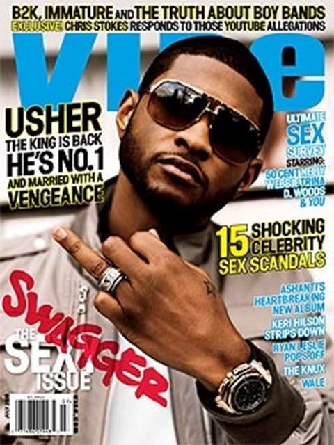
We looked at two different Music Magazines one called XXL and the other called VIBE. XXL generates from a Hip Hop genre, and VIBE is from an R’n’B genre. With XXL the genre is conveyed by the body language and costume. The two artists’ body language is very intimate which shows some sort of protection and the intimacy between them both could suggest them as being homoerotic which can give this magazine a different audience. The tattoos are very masculine, also the jewellery around their neck shows wealth and it links with the masthead- showing the ‘bling culture’. With the VIBE magazine the Artist looks very slick and confident; the glasses make him seem very mysterious.


With text, the XXL magazine is very masculine; it’s very sharp and written in upper case letters. The colour red can indicate passion and power which could suggests how the two artists are like, also the background could suggests where they’ve come from- always remembering who they were before they were famous. With VIBE the typography is much softer; most of the lettering is curvy which could appeal to both male and female crowds. The background is blurred so it makes the audience focus more on the key image; XXL's sell lines connect to the type of music genre it is because all the featured artists’ fall under the category of Hip Hop.


VIBE’s main cover story is about sex and sex sells, so this could attract a bigger audience because people would want to know the latest celebrity gossip. XXL’s main cover story doesn’t give away too much detail of what story is going to be like, this could attract more people to read to find out what may happen; also they use puff’s to boast about their magazine which could grab more costumers so that they get an insight on why the magazine is really good. 


VIBE magazine uses a close up to indicate that the artist is getting married because its one of its main stories which will grab a wider audience because consumers like to indulge in artists personal lives, plus his head is tilted to the side which could suggest confidence. Whereas XXL uses a mid shot to show more of their body posture and Lil Wayne’s head is also tilted to the side which portrays confidence and dominance, the composition and layout gives a stereotypical view on how Hip Hop artists’ are viewed throughout the media.